WAXHISPANO
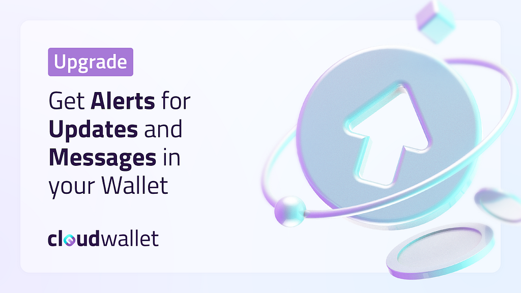
Get Alerts for Updates & Messages in Your Wallet
In today’s fast-paced digital world, notifications have become an integral part of our online experience. Whether it’s an email, a reminder, or an update, the notification system ensures that users are always up-to-date with their virtual environment.
The Icon and Badge Number
The notification icon, symbolized by a bell, serves as an immediate point of contact for users to be aware of their unread messages.. The number adjacent to the bell represents the total count of unread messages, ensuring users have a clear, quantitative understanding of their pending notifications.

Accessing the Notification List
Upon clicking the bell icon, users are presented with a list of their notifications. This list comprehensively includes both read and unread messages. Such a feature ensures that users not only stay updated but can also revisit older notifications if needed.

Distinguishing Between Read and Unread
To ensure clarity and ease of access:
- Read messages will feature a white background.
- Unread messages will be highlighted with a purple-grey background.
This differentiation provides an intuitive user experience, enabling easy identification of unread notifications.

Managing Notifications
Single Message Management: By simply clicking on a specific message, users can mark it as read. However, once this action is taken, it’s irreversible. The system does not permit users to revert a message back to its unread status.
Bulk Management: For those who receive a plethora of notifications and find it cumbersome to manage them individually, there’s the “MARK ALL AS READ” option. With one click, users can instantly clear their notification slate.

Icon Diversity for Message Types
Different types of messages will be accompanied by distinct icons. This means users can quickly ascertain the nature of the notification without delving into its details.

Mobile Integration
Visibility: On mobile devices, the Notification Bell retains its prominence, ensuring users on-the-go have the same accessibility.

User Interface (UI) Considerations for Mobile: While the Notification panel’s user interface is adapted to suit mobile screens, the functionality remains consistent with the desktop version. Users can expect a seamless experience, irrespective of the device they are on.

This notification system has been designed with the user’s convenience and experience in mind. With clear distinctions between read and unread messages, varied icons for different message types, and features optimized for both desktop and mobile, users are ensured a hassle-free and efficient notification management experience.
Check out the brand-new notifications feature at MyCloudWallet.com.